I’m a big fan of WordPress. According to me, there’s no content management system as good as WordPress. With regular updates, huge developer & community support, it just keeps on getting better and better. But there’s just one thing that I absolutely hate about WordPress; And that’s – “the WordPress Android app”
Incorporating the latest Android development practices along with the material design, the app is a beauty to look at. The only thing that hurts is the post composing and editing experience! I even wrote a review on the play store, but unfortunately it has apparently gone unattended. Hence this long, and elaborate post…
This are the PROBLEMS with the WordPress Android App:
1. Mixed visual + HTML window
The WordPress Android app gives you a “single window” for “visual as well as HTML editing“. This makes composing and editing the posts a lot of pain!
Look at the screenshots below to get an idea about what I really want to convey –
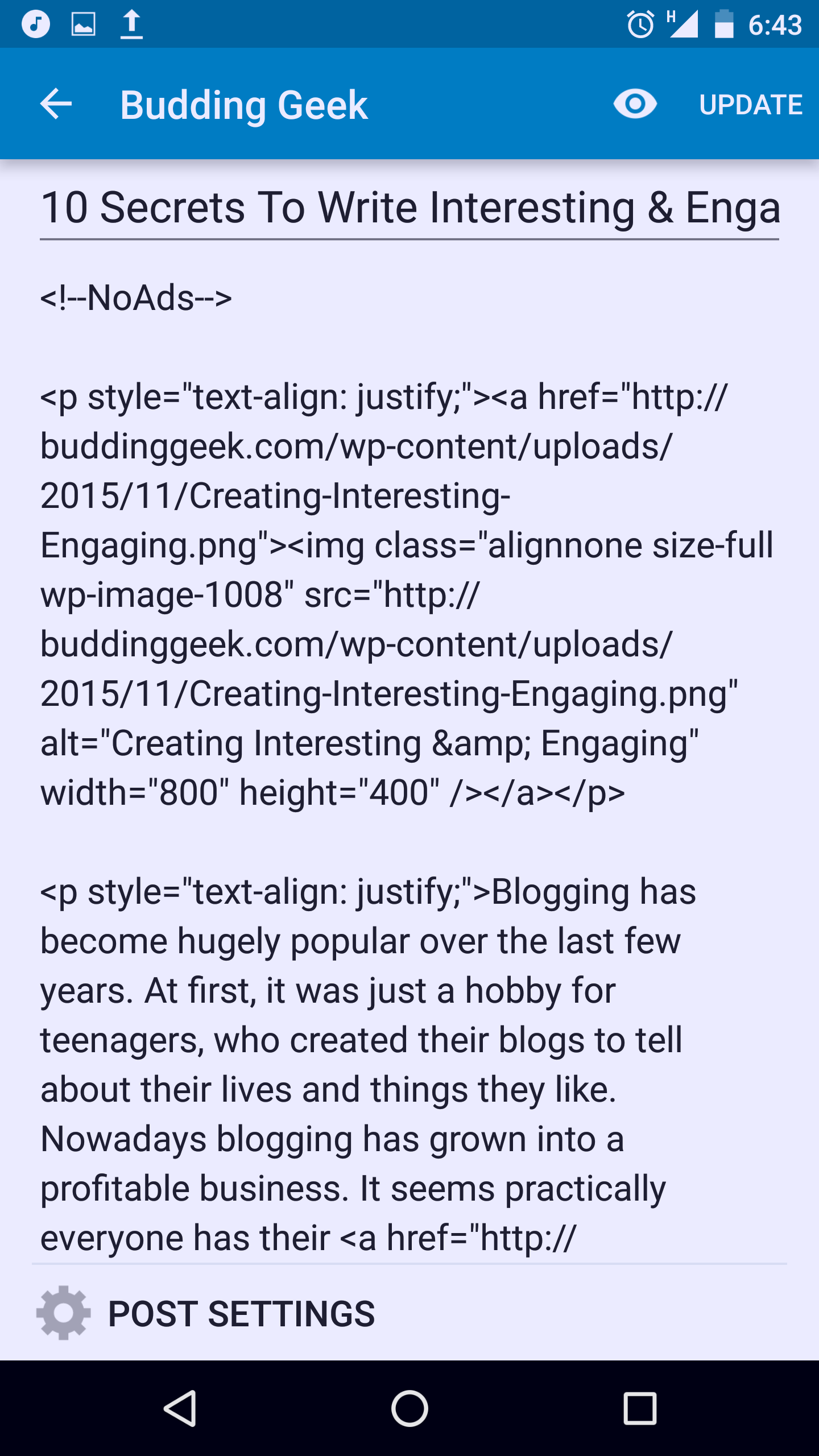
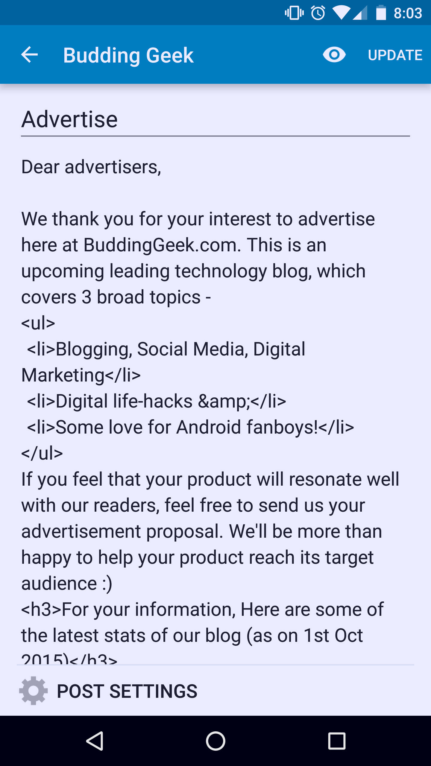
With all those lines of HTML code cluttering the post editing window, updating posts is really an uphill task. I wonder, when the WordPress’s web layout has two distinct windows for visual and HTML editing, then why did they leave it on their android app?
2. Limited Editing Options
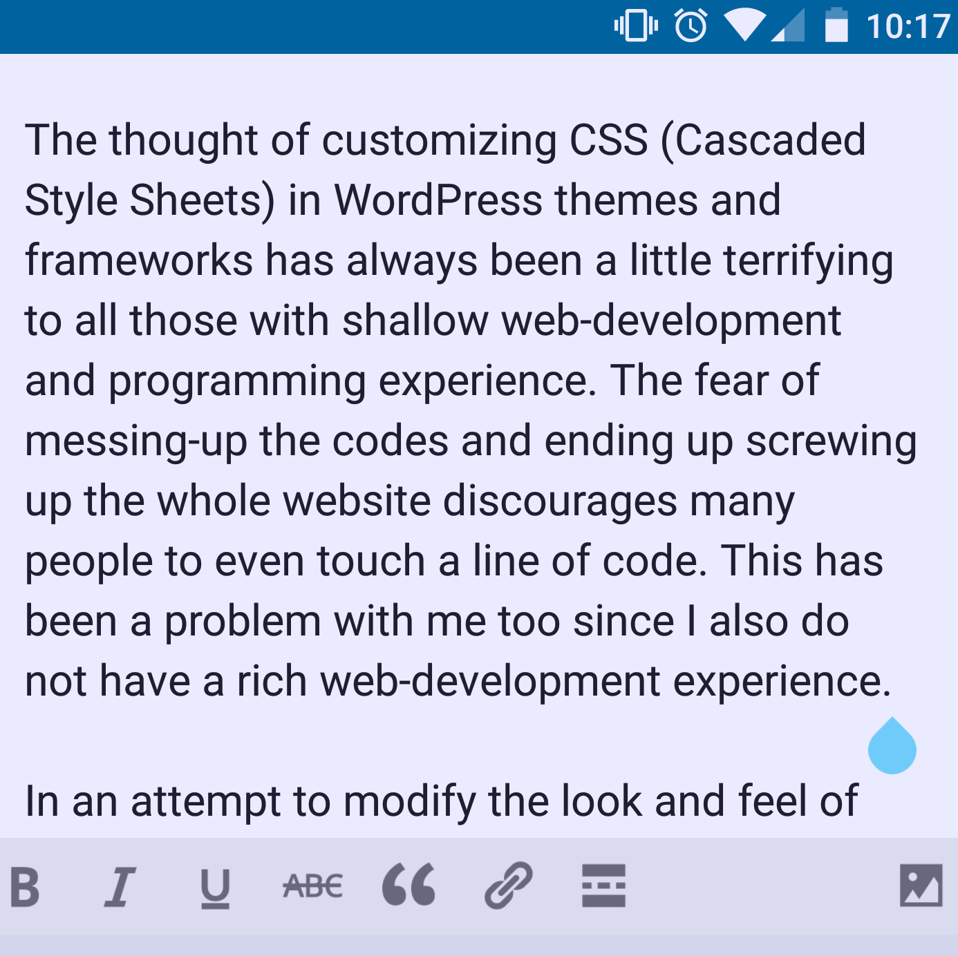
The WordPress android app strips many useful post editing options like Text alignment, Text colors, heading tags, bullets and numbering. These editing options are “essential” for a rich writing experience. The WordPress android app lacks almost all of them. Take some lessons from the EverNote app!
3. An app with a Web-layout? – Reminds me of Windows 8!
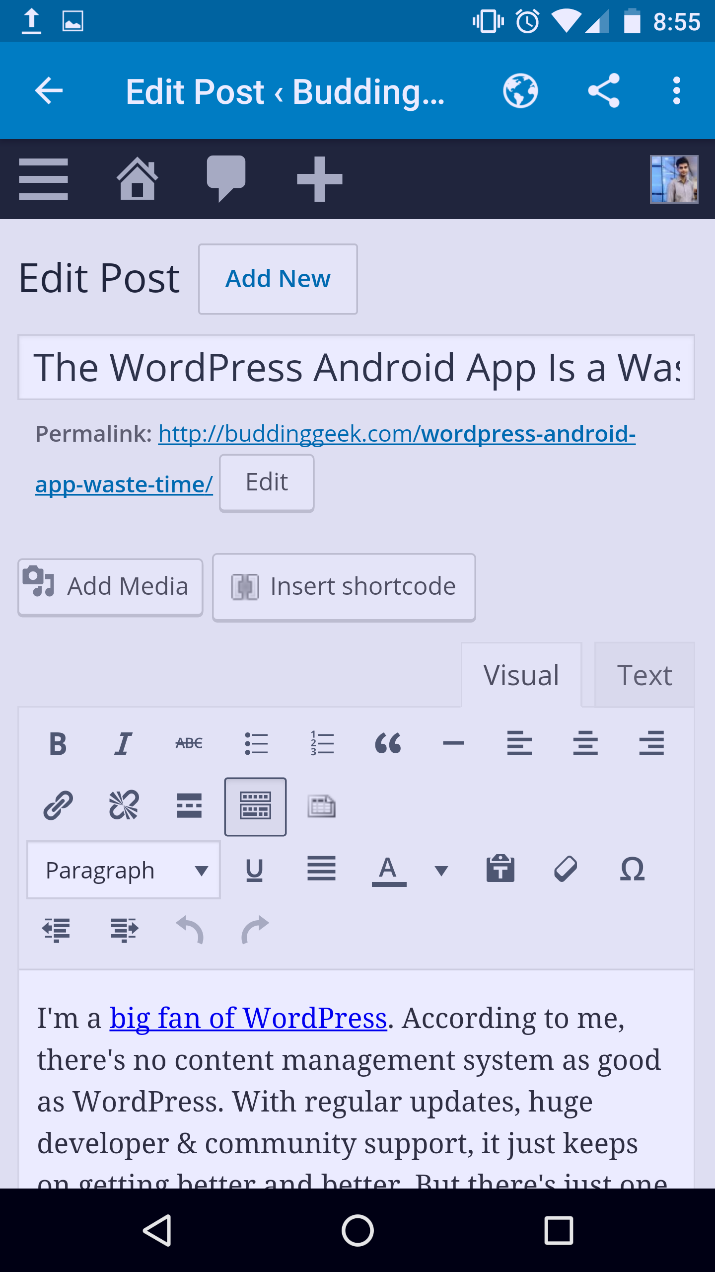
The entire “web-layout” of your WordPress dashboard gets re-produced when you tap on the admin option in the app. This is same like logging in your WordPress website from your mobile web-browser! From this web-layout window, you can do almost anything that is required for maintaining your website – composing new posts (with full editing options & separate HTML window), adding/updating/deleting plugins, comments moderation, you name it. Editing posts in this layout is obviously a lot more productive than the limited (or restricted?) options we get on the app-layout. Instead of downloading this android app, one can easily blog (productively) by simply logging in his WordPress website from a mobile web-browser. My question therefore is – What’s the point of having an app, when it doesn’t make my life easier?
Bottom line:
I LOVE WordPress, its supportive developers, and the entire community. WordPress is the king of all Content Management Systems across the world. When I see a world class software like WordPress, with a mobile application like this, I call in question the coding abilities of its great developers.
Your Review?
I’ve clearly expressed all my views about this android app. It’s your turn now. If you’re a passionate blogging addict like me, you must have tried the WordPress app. What do you like and dislike about the app? I look forward to engage in a conversation with you. Drop your comments below.

I’ve tried the app and I must say it’s very poorly done. not useful at all for webmasters.