Imagine walking into a room jam-packed with furniture. It feels overwhelming, right? Your readers feel the exact same when your blog is a visual assault. While aesthetics do matter, excessive visual clutter hinders the user experience. This is where white space, the hidden hero of blog design, comes in. Today’s post will explore the benefits of utilizing white space on your blog and offer tips to enhance your site’s overall design with a focus on clean design.
What is White Space?
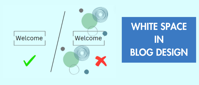
White space is the empty space surrounding and between your content elements, like text, images, sidebars, footer and buttons. Often overlooked, white space plays a crucial role in creating a visually appealing, user-friendly, and ultimately, engaging blog.
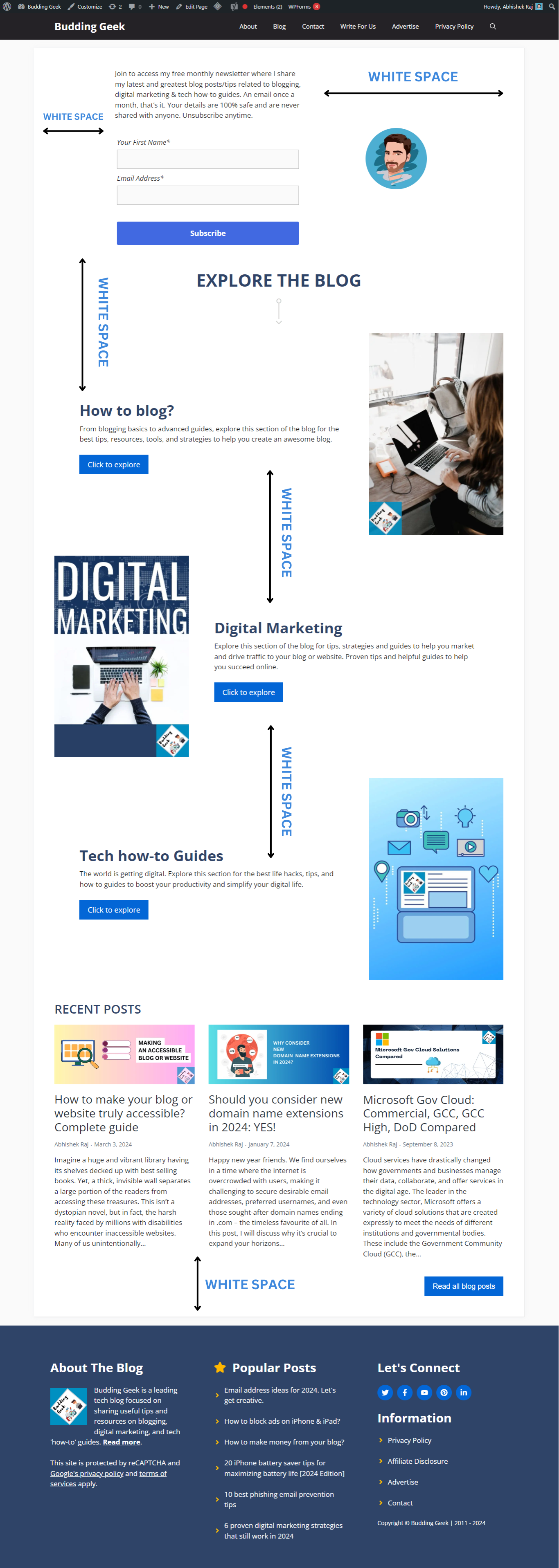
Here’s an example of ‘White Space’ from the homepage of my own website:
Why White Space Matters?
Now that you’ve understood what white space is, let’s now understand why it must be a part of your website or blog design philosophy.
- Better readability: White space is essential for breaking up text blocks, making them easier for your readers to read and digest. Moreover, people today have shorter attention spans, as evident from the popularity of short-form videos like those on TikTok and Instagram Reels. This means they often scan websites for information rather than reading every word. Ample white space provides a breathing room for their eyes, allowing them to quickly grasp the content and stay longer on your website.
- Improved focus: Have you noticed how iPhone reviewers on YouTube showcase the product against a stark white background? This is done to bring all the attention of the to the product by eliminating distractions. This is the same principle behind how white space highlights your website’s key elements. By eliminating clutter, white space draws the reader’s eye towards headlines, images, and important call-to-action buttons.
- It looks modern and professional: In today’s design landscape, minimalism reigns supreme. Strategic use of white space fosters a clean, modern, and professional look that feels fresh and inviting to your readers. It conveys a sense of care and attention to detail, making your blog stand out.
Examples of websites which make awesome use of white space
1. Apple
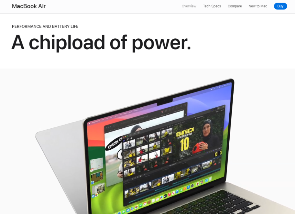
Apple’s MacBook webpage is a masterclass in using white space. Bold fonts and crisp visuals command attention, while generous white space allows the mockups of new MacBook Air to truly take center stage. It’s a testament to Apple’s design philosophy: letting the product speak for itself through uncluttered aesthetics.
2. Google
Google itself is a masterclass in using white space. Their product page feels like a clean and organized workspace.
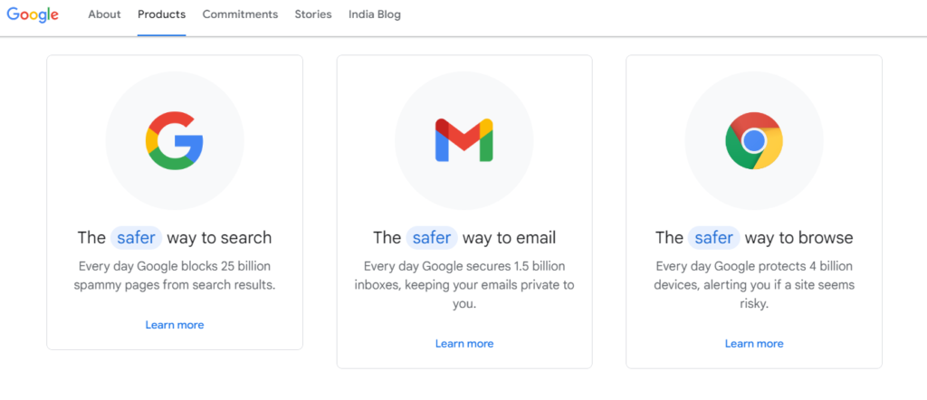
Bold, easy-to-read fonts and clear icons are surrounded by just the right amount of space. It all comes together to create a user-friendly experience that’s easy on the eyes.
3. 1Password
1Password masters white space on their website.
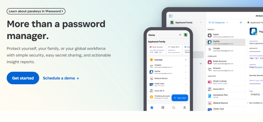
What we like?
- Ample space separates various sections which keeps the overall site layout clean and organized.
- Text and visuals pop against the white backdrop.
- Product screenshots and features are each given breathing room (ample white space) to shine.
4. Airbnb
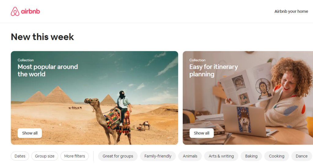
Airbnb leverages white space to create a sense of spaciousness and ease. Their website features large, high-resolution travel photos separated by generous white space. This allows the beauty of the rentals to shine through and inspires users to explore new destinations.
5. Tesla
Tesla’s Model S webpage uses white space beautifully.
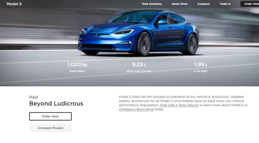
Things we like:
- A vast, scenic backdrop showcases the Model S in all the details, emphasizing its sleek design.
- Clear navigation and concise text descriptions, all separated by ample white space, create a clean and user-friendly experience.
- High-quality visuals with generous breathing room let the Tesla model itself tell the story.
6. Microsoft Windows
Microsoft’s Windows webpage is an inspiring example of using white space effectively.
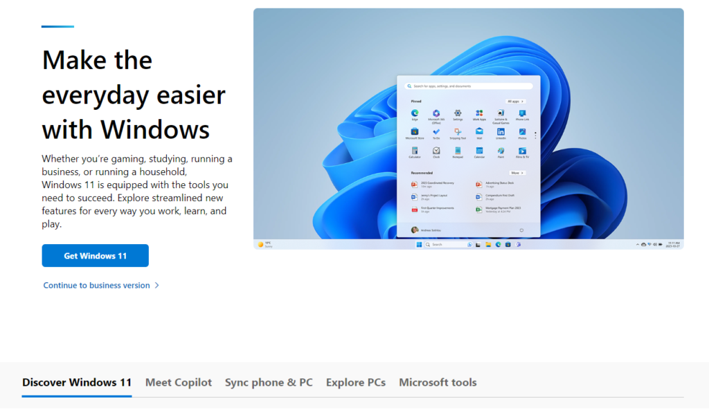
Well spaced sections create a clear hierarchy and facilitate smoother navigation. Clean screenshots and beautiful visuals set against ample white space further enhance the user attention. The hero image showcasing Windows 11 takes center stage with generous breathing room, thus making a powerful first impression. Call to action buttons like “Get Windows 11” and “Learn more” stand out boldly against the stark white background.
What’s your white space story?
So, we’ve explored the power of white space and how it can upscale your website or blog design. But the conversation doesn’t end here! We want to hear from you.
How do you incorporate white space into your own creative endeavors? Do you have a favorite website that uses white space masterfully? Share your views in the comments below.